Role: UI Lead
Timeline: 3 months
Timeline: 3 months
The opportunity
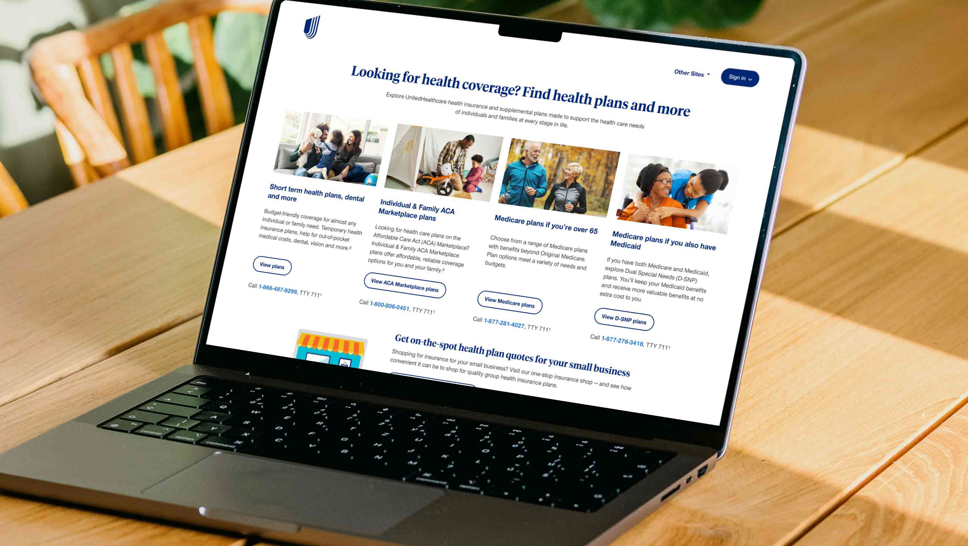
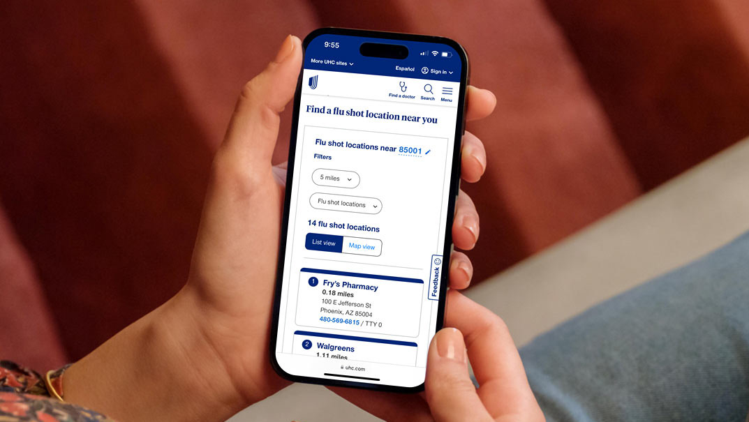
Our SEO expert identified that hiding content in accordions was hurting our search rankings and limiting our visibility in Google's AI Overviews. However, expanding all accordion content would create extremely long pages, forcing users to scroll through irrelevant information to find what they need,
How might we
How might we help users navigate to specific information on a content page without forcing them to scroll through irrelevant content?
Requirements and concerns
SEO requirements:
All content needed to be visible to search engines
Accordion-hidden content was being deprioritized by Google
Poor performance in AI overview results
UX concerns:
Long pages with all content expanded would be overwhelming
Users would lose their place while scrolling
Finding specific information would become time-consuming
Mobile users would be especially impacted
The research
I began by researching user interface components and layout patterns that could help users quickly move through a long page to find the necessary information. After searching popular UI sites such as Component Gallery, I found a solution: An anchor link menu. An anchor link menu is defined as a "user interface component that provides fast navigation within long, single-page content by linking to specific sections".
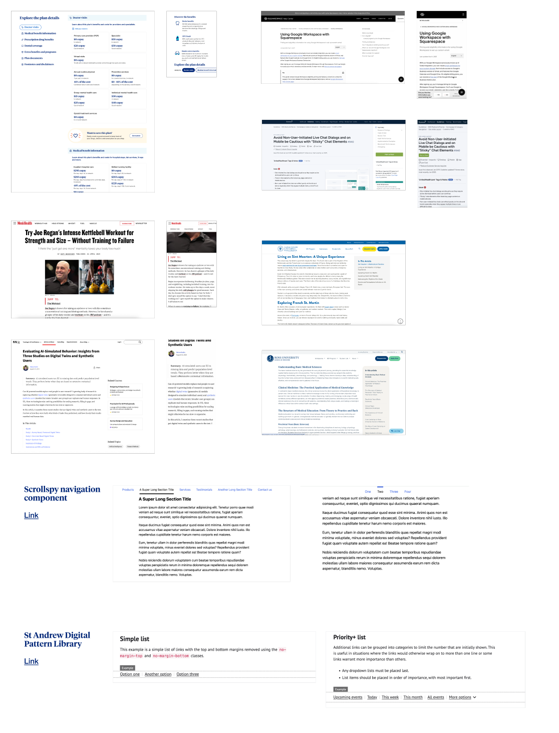
I continued my research, this time focused on finding different examples and treatments of anchor link menus. I found inspiration both within the enterprise and across the internet. I studied and compared the placement on the page, the interactions and tap targets, and how they differed from desktop to mobile.
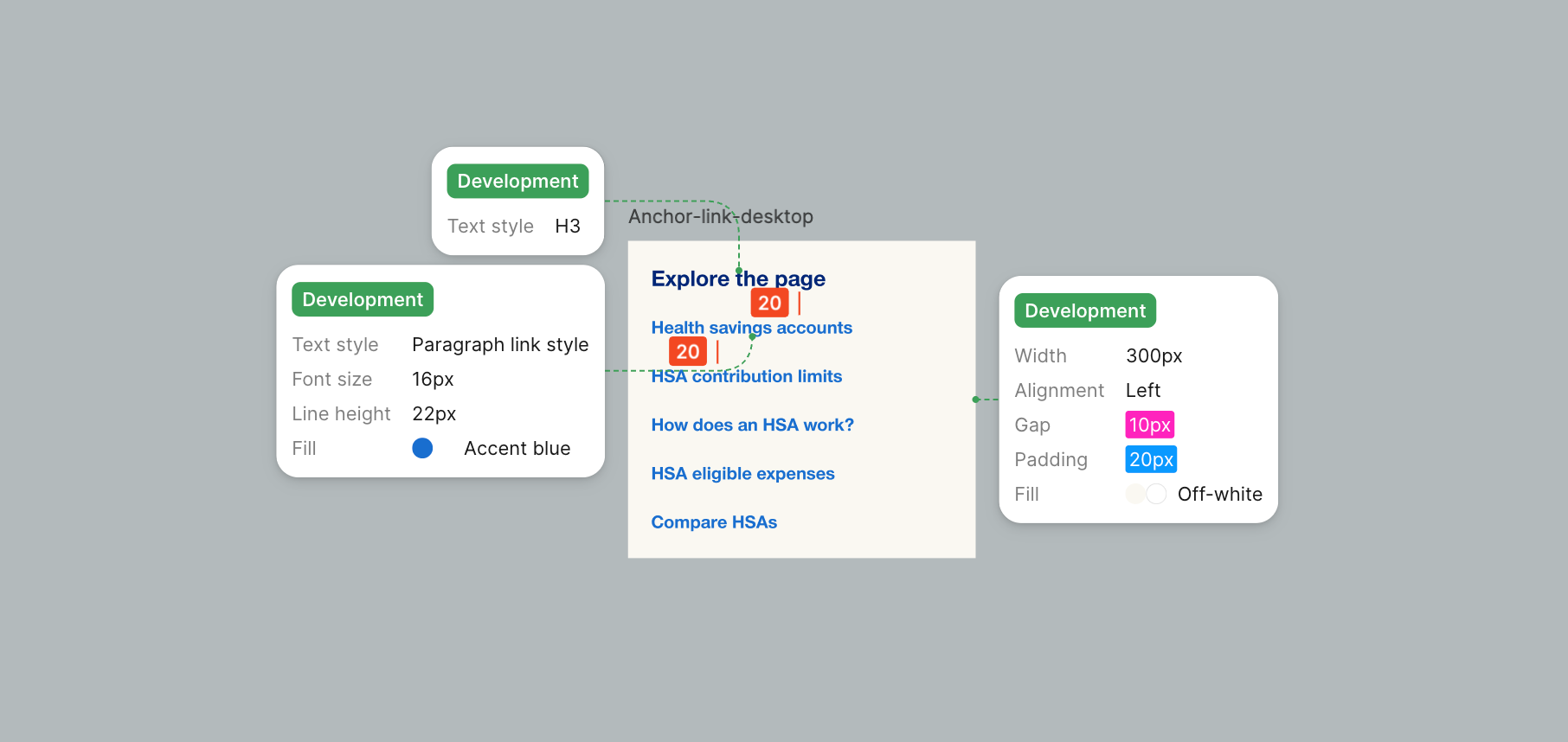
Component anatomy
After building out a library of inspiration, it was time to start mapping out the anatomy of the component.
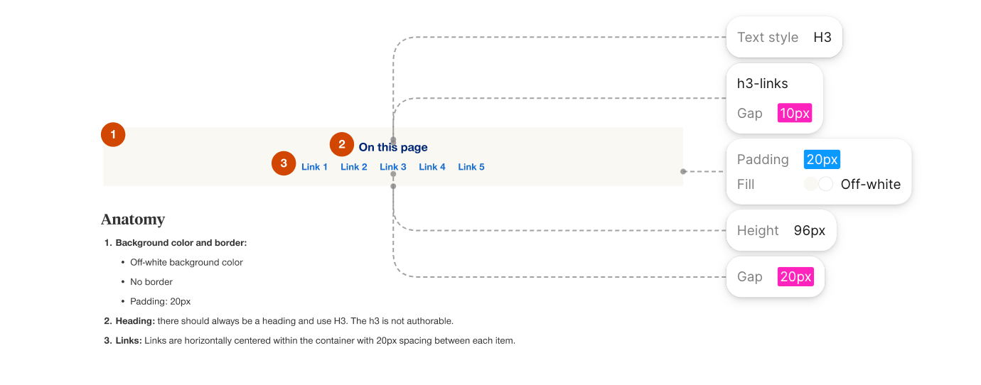
I focused on using existing colors and text styles in hopes to reduce dev complexity and keep consistency with our existing components in the design system. We use our light blue and gray colors for call-out containers on the pages, so I opted for our off-white for the background color of the anchor link menu component. I used our h3 and link styling for the text styles in the component.
Challenges
While building out the component, we ran into a few challenges that required quick solutions to ensure the component could be built on time for launch.
The first challenge focused on desktop vs mobile views. The desktop component would need to utilize horizontal space across the page to keep the height of the component small, as we wanted to introduce this component as an A/B test and avoid pushing page content too far down the page. However, the mobile view, with limited horizontal space, would need alternative, condensed, approach to display all of the anchor links.
Midway through the project, the scope of our project expanded beyond our left-navigation pages to include full pages as well. Each page structure presented different constraints -- the left nav pages had vertical space to stack links, while the full-width pages required a fundamentally approach. To address this, I designed a second variant of the compoent that leveraged the horizontal space available on those pages. The links are horizontally centered within the container with 20px spacing between each item.
Our final hurdle was handling the page headlines. Our copywriters often write longer H2s with SEO in mind, but that length didn't translate well to the anchor link menu -- both variants had limited space, making text wrapping a real concern. To solve this, I partnered with the copy team to develop a shorter, distinct set of link labels for our initial A/B test.