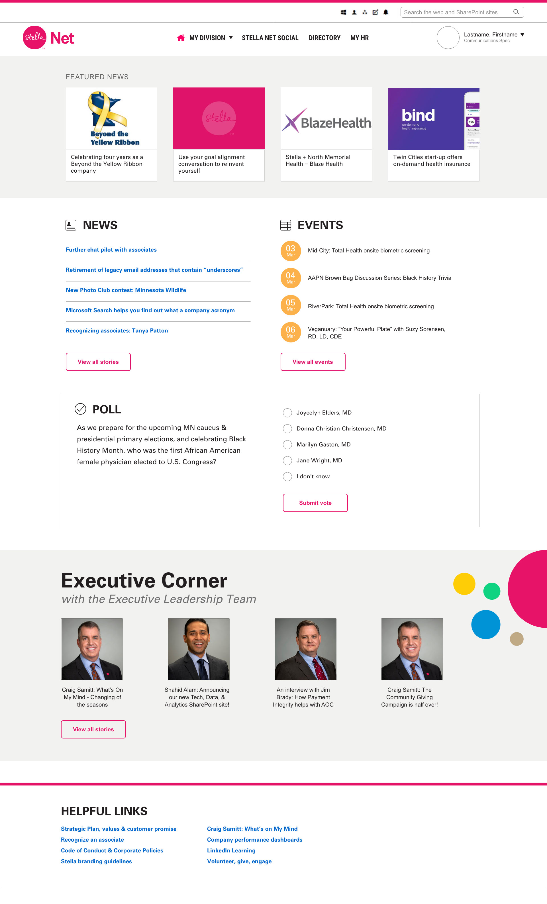
At Stella— the parent company of Blue Cross and Blue Shield of Minnesota— innovation is at the heart of efforts to drive better, bolder and broader solutions in the health care system.
When I was first approached by members of the Stella team, user research had been completed of the existing Stella Net intranet homepage. Out of 1200 users surveyed, almost half had described their current experience as ‘cluttered’, ‘overwhelming’, or ‘confusing’. A change to the homepage was needed, and with a Stella rebrand in progress, there seemed like no better time.
Based on what was learned from the survey, the opportunities were clear. The main objectives of the Stella Intranet homepage redesign were:
1. The product adding value to what that user needs
2. Compelling and clear visual design
3. Ensuring the design created could be built and maintained on the intranet’s CMS (Unily)
The survey also provided answers to what users enjoyed most on the homepage. The ‘News’, ‘Upcoming Events’, and the ‘Poll’ were rated the most favorable sections on the homepage. The analytics supported the survey and even strengthened the importance of making featured news the focal point of the redesign. The Stella team published 10-20 news articles each week, so I needed to make sure the featured news was prominent while still giving a certain emphasis to other news stories.
My ideation phase let me approach the opportunities from a variety of angles. After sketching wireframes, I created low fidelity mockups to arrange popular sections in prominent places on the page and get a better understanding of spacing and layout. I wanted to give the page sufficient negative space to appear less cluttered and emphasize each section. While working on the digital mockups, I was meeting with the Stella team to ensure all options were feasible on the Unily platform.
Once a layout was approved, it was time to turn it into a high fidelity mockup that would be ready for testing. The Stella rebrand significantly reduced the number of colors being used on their digital and print assets. The current homepage has a variety of colors that can be overwhelming so it was an exciting change to focus more on typography and negative space.
Due to COVID-19, we completed the A/B testing remotely with a couple dozen current Stella employees. Because we were only changing the homepage, we decided against asking the user to complete tasks and focused on the visuals to make sure we had designed a well thought out and clear visual design. The reviews were positive and confirmed both what the users said on the survey and that we had accurately addressed the concerns.