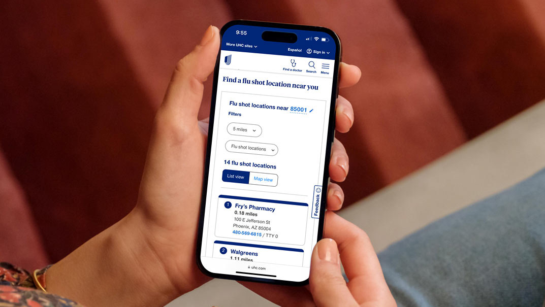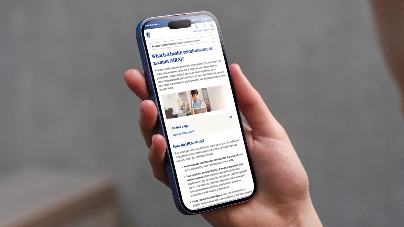
In 2021, we identified an NPS gap that customers using the mobile viewport cannot locate the Search or Find a doctor (FAD) functions. We wanted to improve the user experience by making the Search and FAD buttons more visible in mobile UI.
In the 2021 experience, these features are visible by clicking into the ‘Menu’.
Analytics show very low engagement with FAD and Search functions in their current location
My hypothesis was that by moving these features from inside our menu to our mobile header, we will improve the discoverability and drive more engagement.
I partnered with our Optimization and Personalization team to create two individual A/B tests. The tests introduced FAD and Search functions and proved to be successful and help guide my design decision making process.

During the design process, I ran into a unique situation. The Brand team believed that because our UMark logo was relatively new and we had just completed our rebrand, it could not stand alone and needed the supporting "UnitedHealthcare" logotype next to it. I designed and worked with developers to create a microanimation that would show the UMark and logotype, but on scroll, animate into our UMark. The solution was approved by the Brand and product owners loved the idea of including a subtle microanimation into the header.
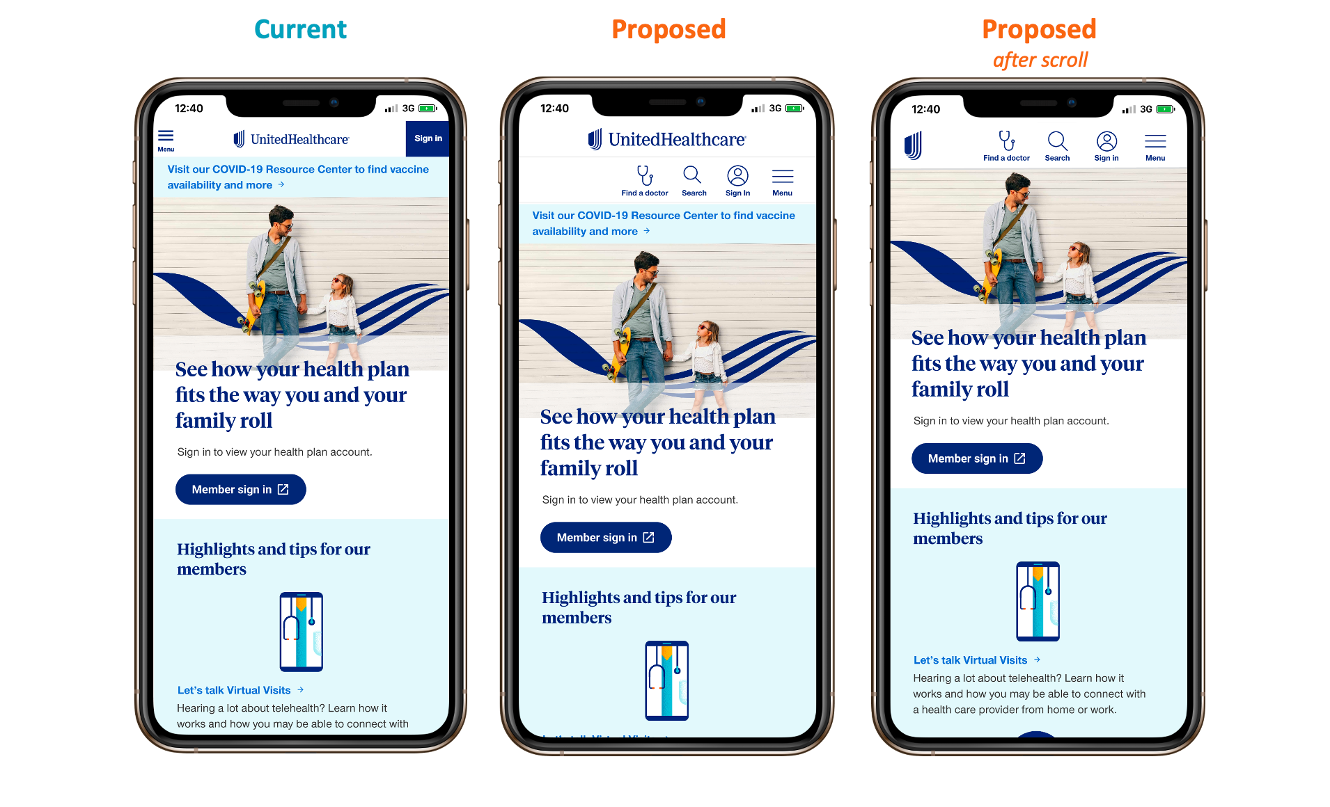
We went live with this updated mobile header in early 2022. The header has made significant changes since then, as we introduced insurance shopping on our site and added different lines of business onto uhc.com, but I am proud of the mobile header redesign and the impact it made for improved visibility on critical features on our site.