Redesigning personalization: What a 54% sales drop taught us about user trust
Some of the most valuable design insights come from things that don't work. In September 2025, a redesign I led for one of UHC.com's highest-trafficked pages produced a result nobody expected: A 54% decrease in lower-funnel sales. What followed -- rapid research, reframed assumptions, and cross-functional realignment- turned a failed A/B test into one of the most strategically significant projects of my career.
Role: UX Lead
Project timeline: 6 months
Project timeline: 6 months
Overview
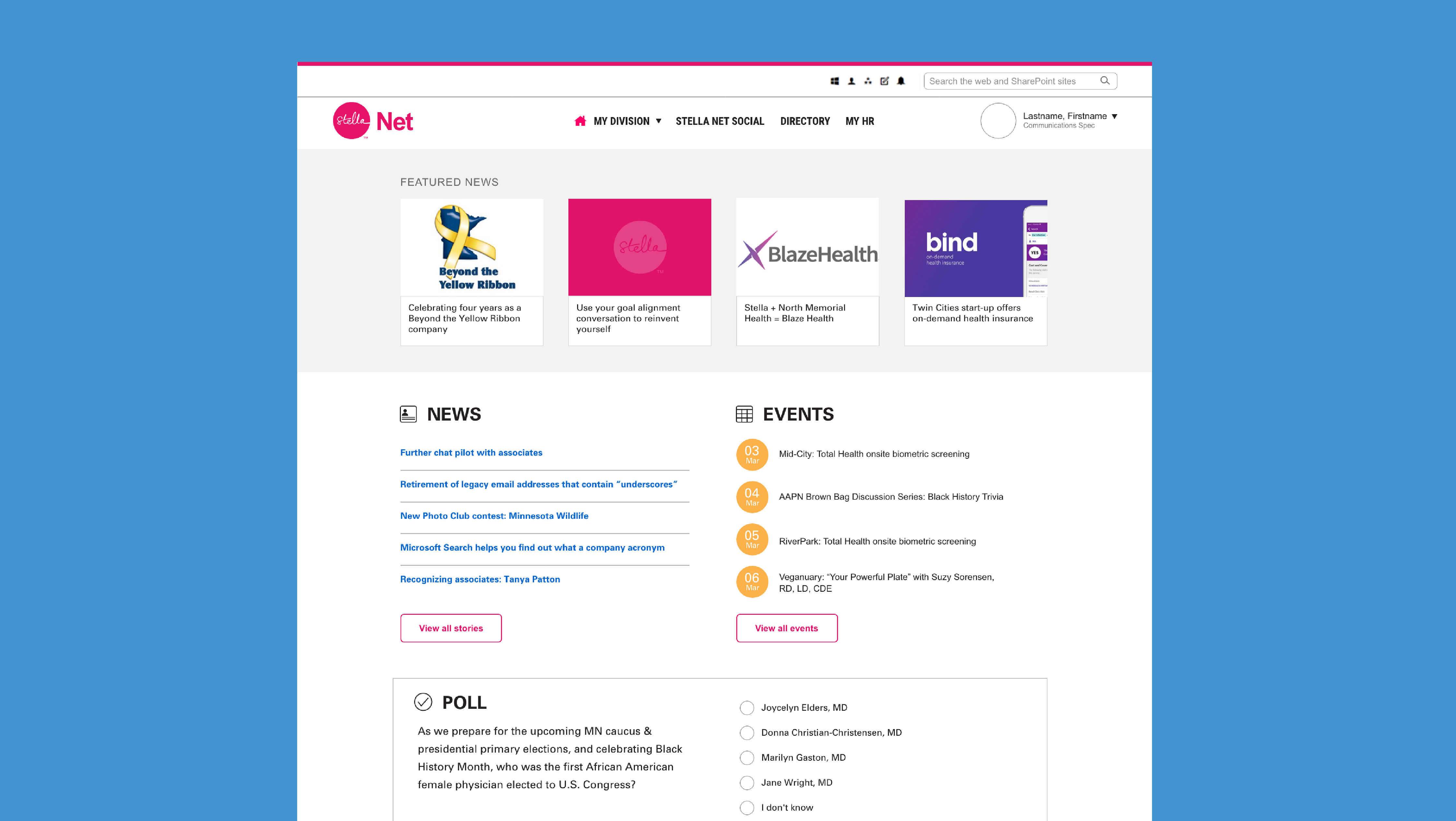
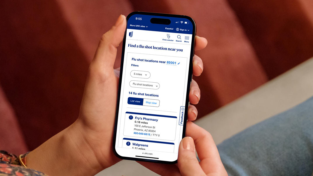
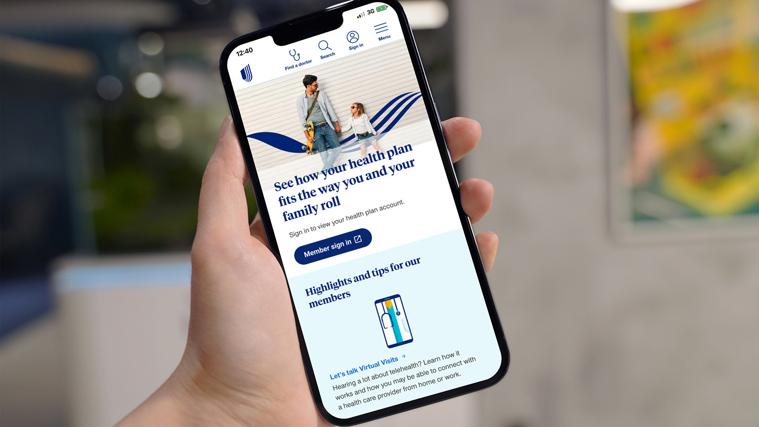
The Consumer Centric Search (CCS) page serves as a critical first touchpoint for potential UHC customers, receiving an average of 150,000 visits per week. As UX lead since 2021, I've guided this page through multiple iterations, transforming it from a fragmented collection of landing pages into the third-most visited page on uhc.com with a 22% exit rate to sales funnels.

The opportunity
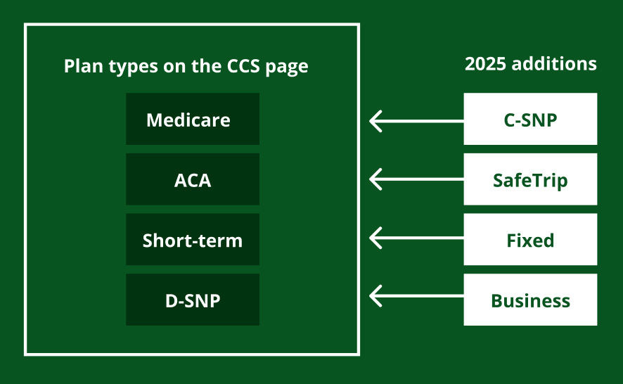
Prior to 2021, individual product teams managed their own paid media campaigns independently, creating a chaotic user experience with high bounces rates. We created the CCS page to bring a unified front of UHC insurance products to the user and focused on the main four plan types: Medicare, ACA, Short-term, and D-SNP.
By 2025, the page had seen years of success and needed to accommodate additional lines of business without compromising the streamlined experience we had cultivated.
By 2025, the page had seen years of success and needed to accommodate additional lines of business without compromising the streamlined experience we had cultivated.
Adding more lines of business could overwhelm users with too many choices. This raised a critical question: are there other ways we can guide users into the right plans?
Design approach
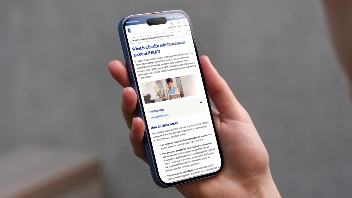
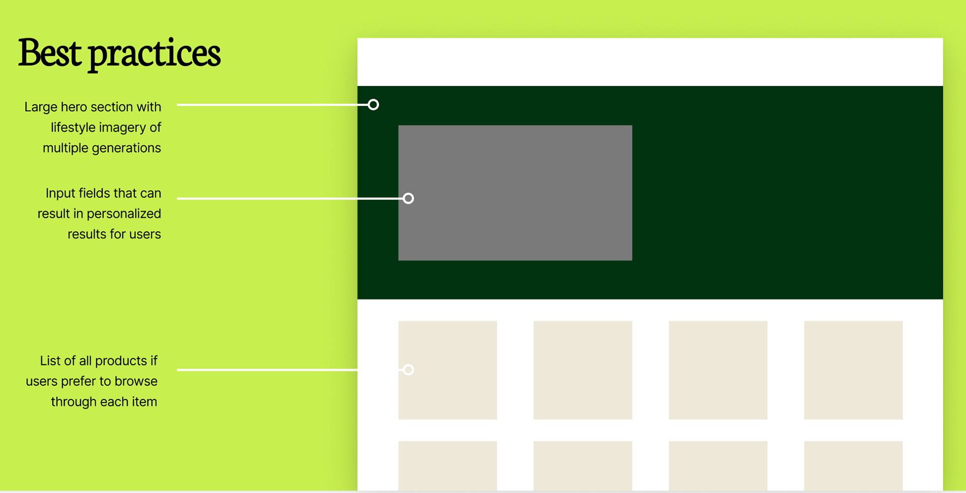
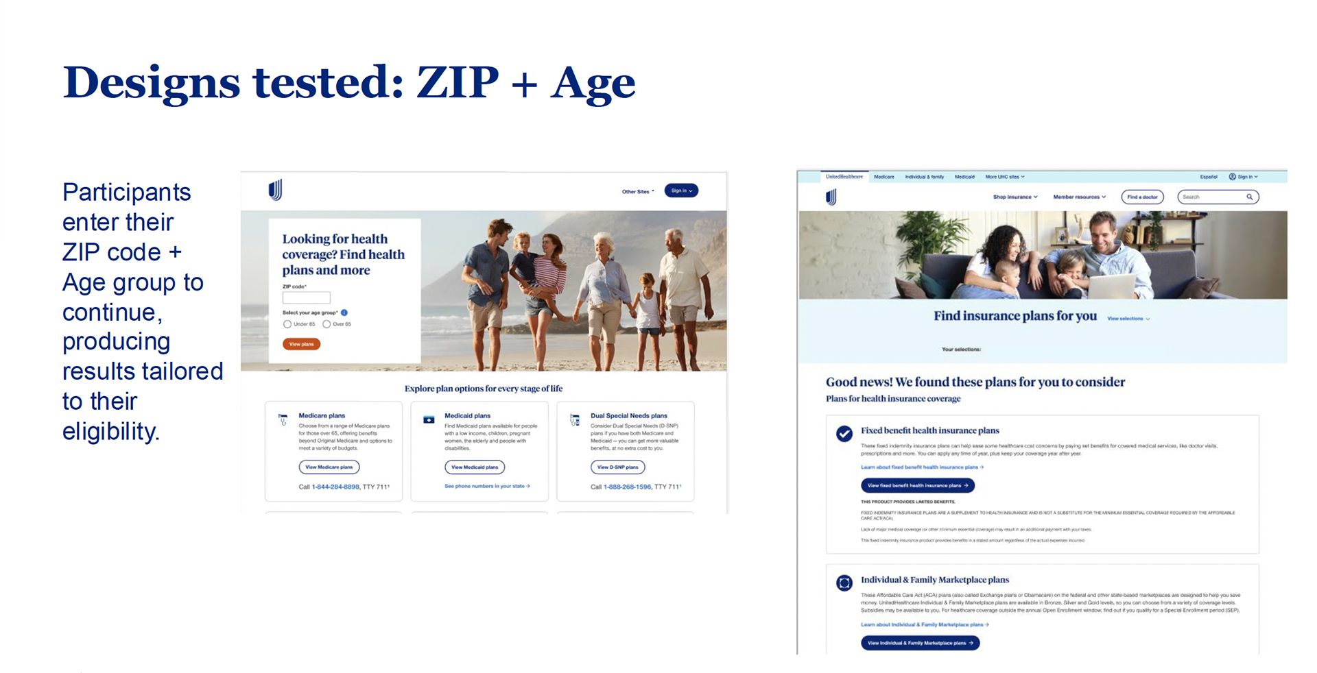
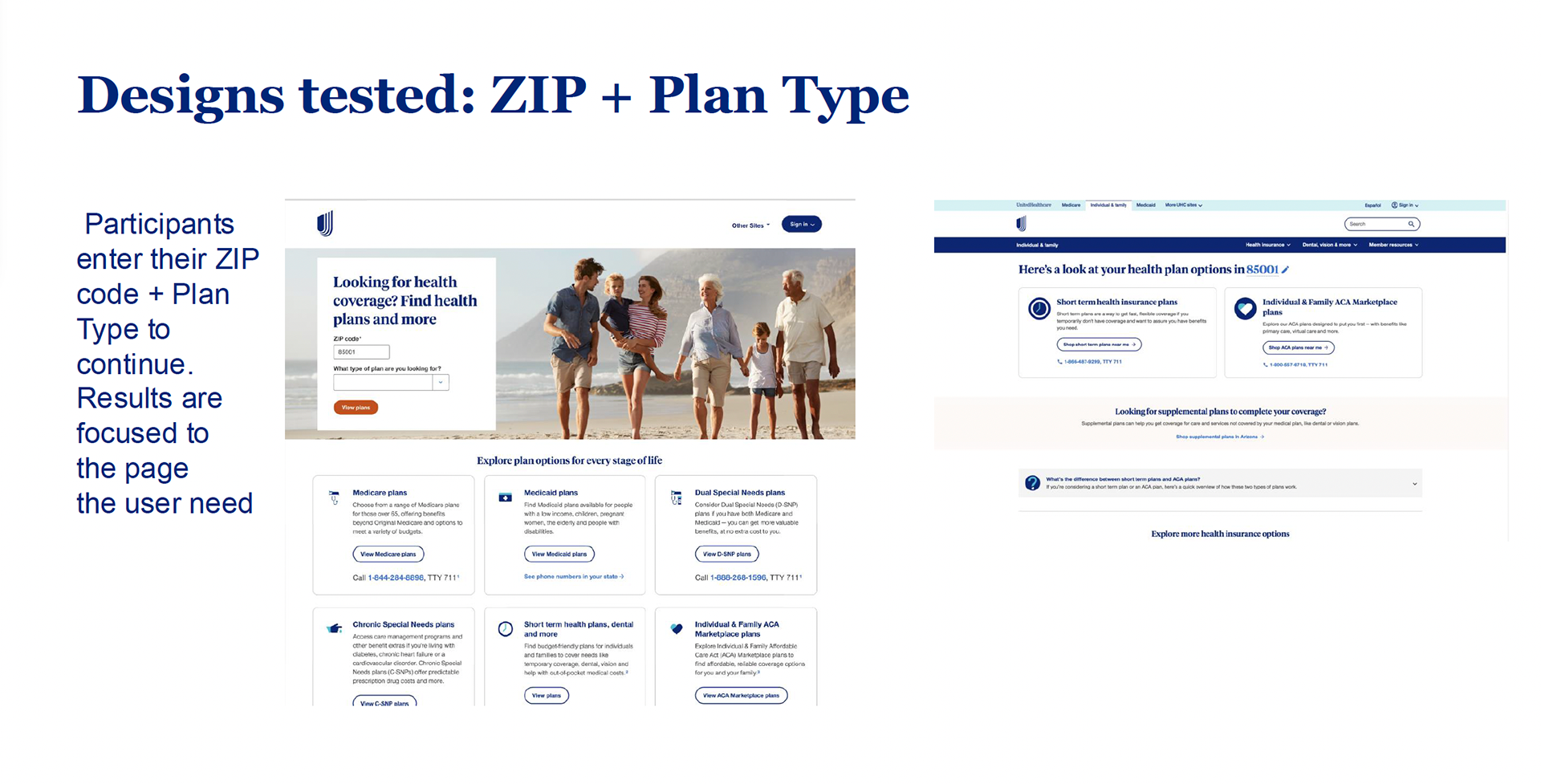
I analyzed years of A/B testing on the CCS page and competitors landing pages to identify our highest-performing components. Two elements seemed to consistently drove success: input fields that allowed users to specify their needs, and product tiles displaying lines of business with CTAs and contact information.
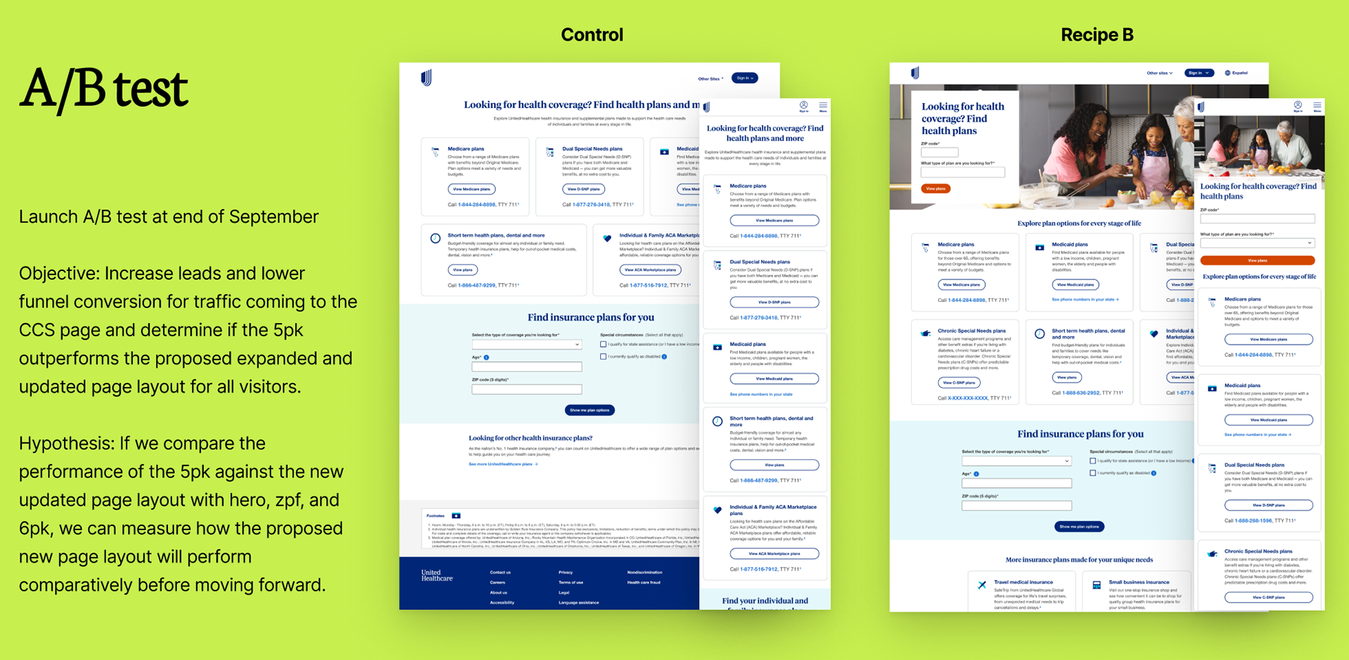
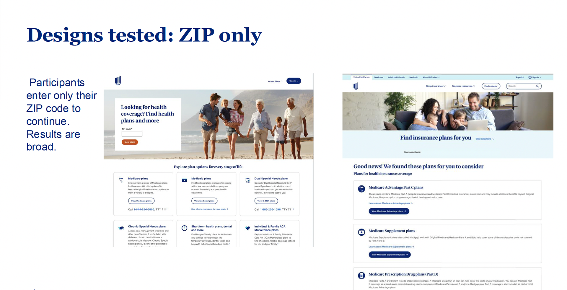
I presented my findings to key stakeholders, and they approved and wanted to move forward with a single input field prompting users to enter ZIP code and display results based on their location. I created user flows showing how collecting age in addition to ZIP code would significantly narrow results to plans users actually qualified for, rather than overwhelming them with irrelevant plan options.
My hypothesis was that this strategic personalization would improve funnel conversion by help users navigate the expanded options more effectively.
The unexpected results
We launched the redesigned layout in September 2025 as an A/B test. The results were shocking: a 54% decrease in lower funnel sales.
Paradoxically, engagement with the input fields was high. Users were interacting with the personalization features, but they weren't progress to the next steps. Our quantitative data could not explain why.
Research & discovery
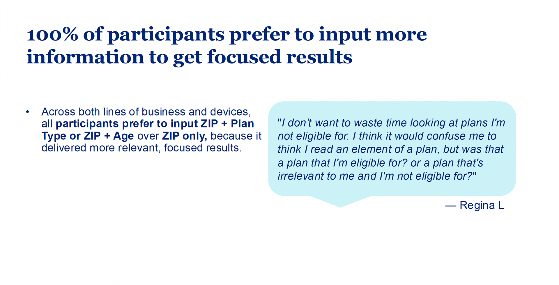
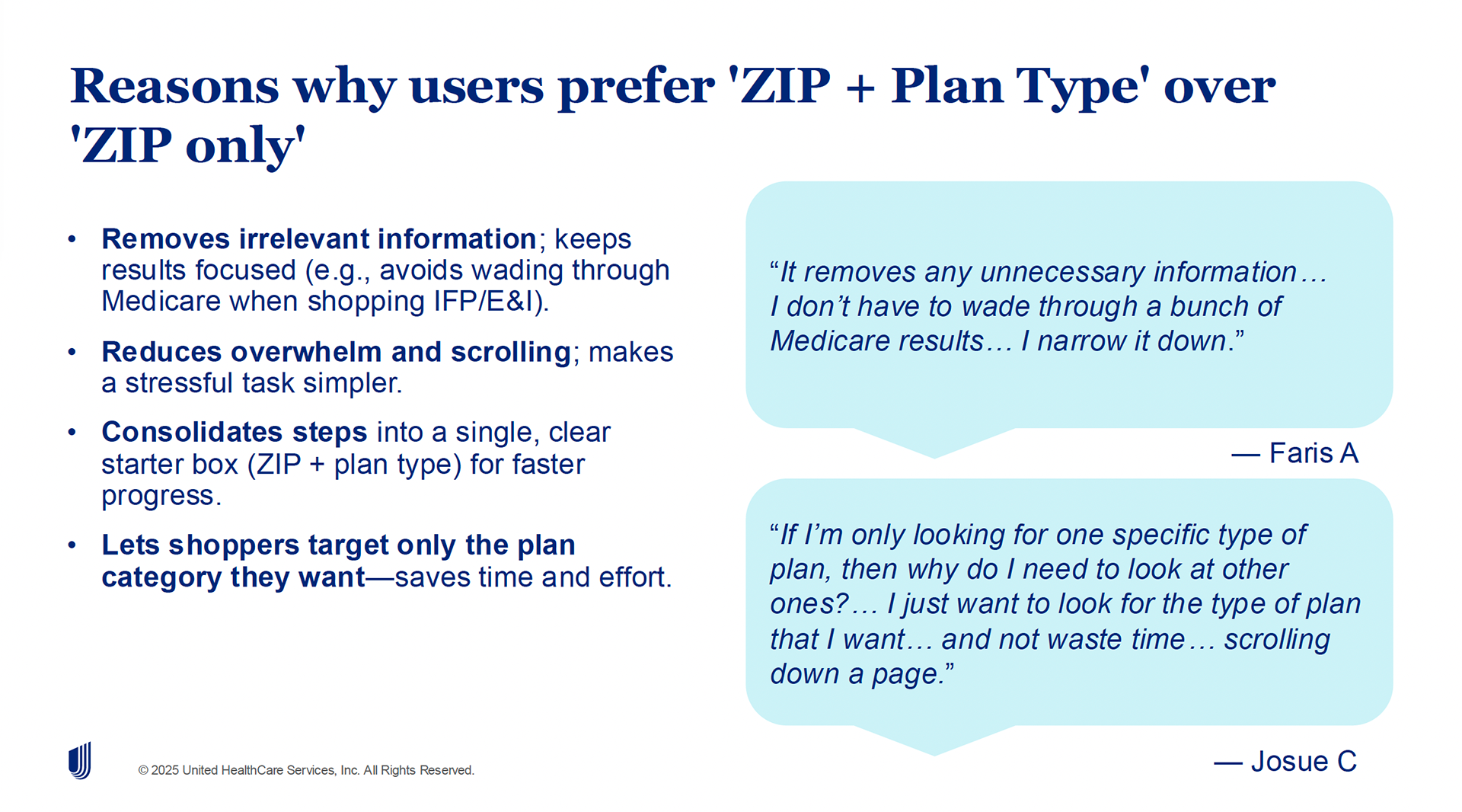
I immediately partnered with our user research team. I created detailed flow charts and interactive mockups for testing sessions to uncover how input requirements influenced users' perception of plan relevance and their overall experience. The test ran for two weeks with ten participants, spanning across different insurance plan types (Individual and family, Medicare, Medicaid).
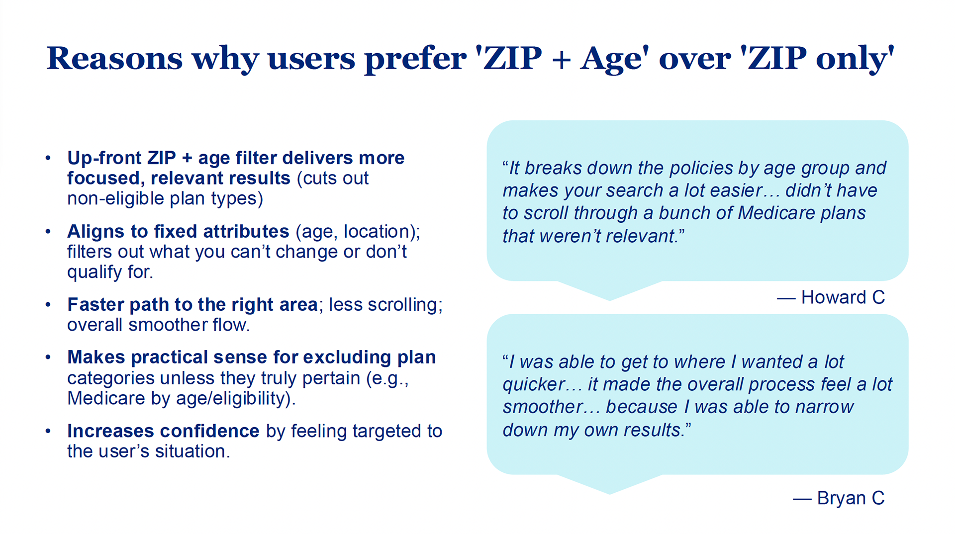
The research revealed a critical insight: 100% of participants preferred to input more information if it meant receiving focused, relevant results. Users weren't frustrated by the input fields -- they were frustrated by what happened after they filled them out.
This reframed the entire problem. Users engaged with our personalization features because they expected personalized results. When the subsequent search results page didn't deliver on that implicit promise, the experience fell apart.
Key insights
Users are willing to share personal information when they trust it will lead to genuinely relevant recommendations. Our users actively demonstrated this preference.
Personalization isn't a single-problem. Creating input fields without ensuring the entire downstream experience delivers on expectations creates a trust gap that destroys conversion.
Impact & lessons learned
While the redesign is ongoing, the insights gained have already influenced how UnitedHealthcare approaches personalization across digital touchpoints. The findings are informing conversations about data collection, results relevance, and cross-functional coordination -- addressing the same siloed approach that created problems in 2021.
This project reinforced that data-driven design requires both quantitative and qualitative research. A/B tests told us what was happening; our user research told us why. It demonstrated that user experience extends beyond page boundaries -- solving problems in isolation can create new problems downstream.
Current state & next steps
The failed test and subsequent research expanded the scope beyond the CCS page. We now understand that delivering on user expectations requires redesigning both the CCS page and our UHC.com search results page as an integrated experience.
I'm currently working with the research team and stakeholders across multiple lines of business to map the complete user journey from initial search intent through plan selection. The goal is to create a cohesive personalization framework that respects user privacy while delivering the focused results users expect.